In today’s digital landscape, creating an inclusive online experience is paramount. Developers adapt their solutions to various devices and usage scenarios – so that anyone can access a particular product under any conditions of use. From our experience, we can see that customers usually include here various factors: adaptability to different screens, data optimisation for fast loading even with a poor connection, and good resource accessibility from different places of the world. But less attention is paid to Web Accessibility.
“Web accessibility means that websites, tools, and technologies are designed and developed so that people with disabilities can use them. More specifically, people can perceive, understand, navigate, and interact with the Web, as well as contribute to the Web.” – W3C Web Accessibility Initiative.
- 15% of the world’s population has some sort of disability
- Up to 1 in 4 (26%) adults in the United States have some type of disability
- 62% of adults with a disability own a laptop or desktop computer compared to 81% of adults without a disability
- 72% of adults with disabilities own a smartphone
- There are an estimated 300 million people in the world with color vision deficiency which requires color-adjusting tools on sites
These numbers make us ponder about the Web Accessibility of the solutions being developed, don’t they?
In this blog post, we want to specifically focus and explore the significance of color and contrast accessibility for websites and how it can greatly enhance user experience. We also provide practical insights into our approach to color accessibility through a real-life case study.
📎 Understanding of Color Accessibility:
Color accessibility refers to the design considerations and techniques employed to ensure that individuals with color vision deficiencies or blindness can effectively perceive and engage with digital content. By leveraging suitable color combinations, contrast ratios, and alternative text options, we can create a more inclusive web environment.
🤔 Why we should pay attention to color accessibility:
- Inclusivity: By prioritising color accessibility, we can provide equal access to information and services for all users, irrespective of their color vision abilities. This fosters inclusivity and demonstrates a commitment to diversity and accessibility;
- Improved Usability: A well-designed color palette with appropriate contrast levels enhances readability and usability for all users. It ensures that important elements, such as text and interactive buttons, are easily discernible, resulting in a more intuitive and enjoyable user experience;
- Compliance with Standards: Adhering to established guidelines, such as the Web Content Accessibility Guidelines (WCAG), ensures that our web applications meet legal requirements and accessibility standards. This not only protects against potential lawsuits but also reflects our dedication to social responsibility;
- Expanded User Base: By incorporating color accessibility into our design process, we open doors to a wider audience. Individuals with color vision deficiencies or blindness can fully engage with our web applications, expanding our user base and potential customer reach.
💡How to meet the color and contrast web accessibility:
WCAG (Web Content Accessibility Guidelines) were designed to help developers achieve the desired result in the color and contrast content accessibility. Here we can find all the details you need to prepare a design that meets accessibility standards for various forms of color blindness. WCAG provides specific recommendations for making web content perceivable, operable, understandable, and robust. Key points a developer/designer should pay attention to are: understand the guidelines and success criteria outlined in the guidelines, make sure you use proper color contrast ratio, use the color and contrast checker while designing, regularly review and update your website to ensure continued compliance with WCAG standards.
🧩 Case study from our experience
At IT-Dimension, we understand the importance of ensuring that our web applications are accessible to all users, regardless of their abilities. Let’s check our real case on implementation of color and contrast accessibility for web application.
Project background: Our design team was tasked with creating a new web app that met the Web Content Accessibility Guidelines (WCAG) standards for color and contrast accessibility. The challenge was to design a visually appealing web solution that could be accessed by all users, including those with color vision deficiencies or blindness.
How we solved it: Through meticulous research and an understanding of WCAG standards, we chose contrasting colors for text and background, ensuring general readability for all users. By simulating various types of color blindness, we fine-tuned our color choices and ensure that the information conveyed through color was also discernible through alternative means, such as text labels or icons.
What tools we used: Figma, Figma plugins (Color Blind, Color Contrast Checker, Stark), WCAG guidelines.
What result we got: We got a visually stunning web application that is accessible to users with different types of color vision deficiencies. The careful selection of contrasting colors and optimal contrast ratios resulted in a web app that met WCAG standards while maintaining its aesthetic appeal.
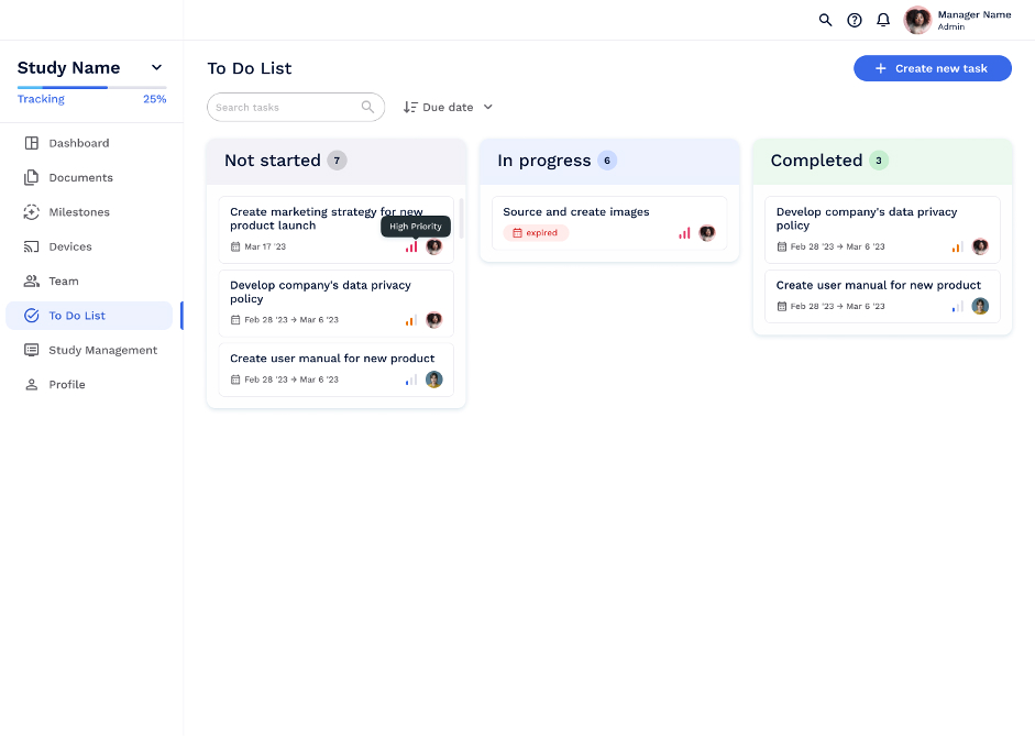
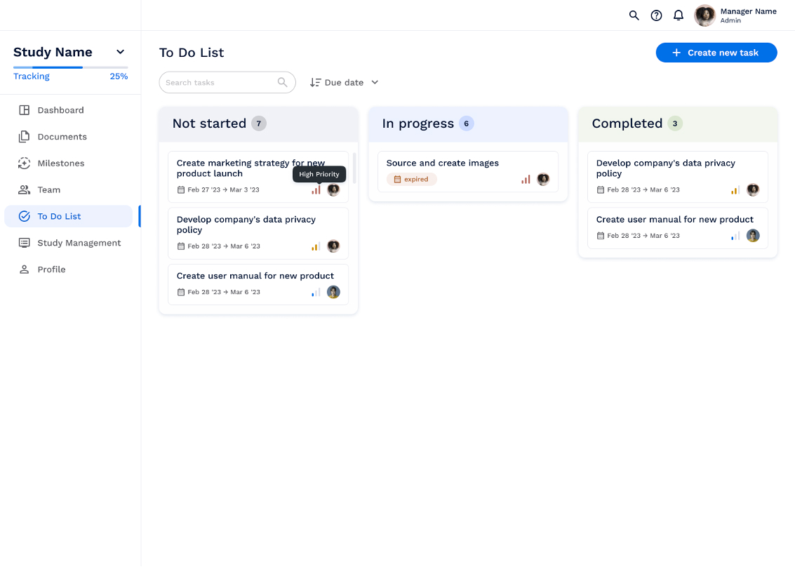
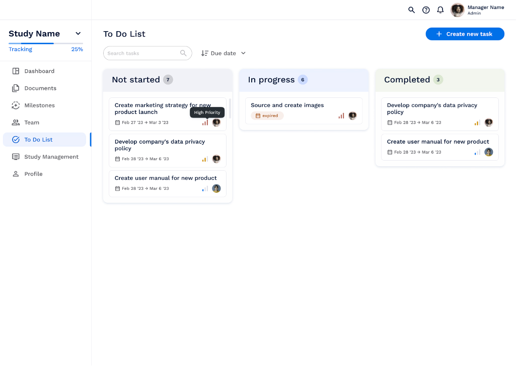
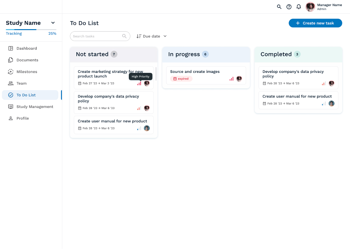
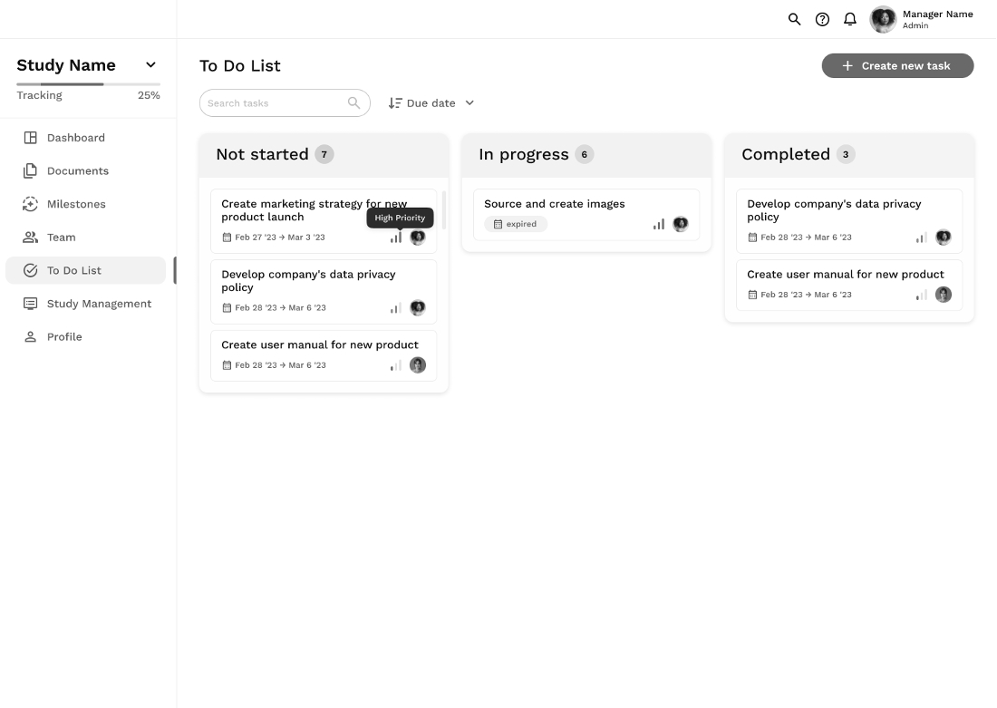
See the screens of the result for different types of color blindness here.
Page through the eyes of a non-colorblind user
Page through the eyes of a user with protanomaly (a person can see green, but it looks faded and indistinguishable from other colors)
Page through the eyes of a user with deuteranomaly (a person can see red, but it looks faded and indistinguishable from other colors)
Page through the eyes of a user with protanopia (a person cannot distinguish red). Instead of red, they see shades of gray or greenish yellow.
Page through the eyes of a user with deuteranopia (a person cannot distinguish green, instead of green, they see shades of red or blue).
Page through the eyes of a user with tritanomaly (a person has a reduced sensitivity to blue, i.e. the blue color looks more faded and less bright).
Page through the eyes of a user with tritanopia (a person cannot distinguish blue, instead of blue they see shades of green or red).
Page through the eyes of a user with achromatopsia (a person who sees almost or completely no color). People with achromatopsia see the world in black and white, and shades of gray.
Prioritising color and contrast accessibility in web design is not only a legal and ethical responsibility, but also a pathway to creating a more inclusive digital space. By expanding the scope of this field, we create all conditions so that anyone can fully engage and benefit from the vast array of online content and services.
At IT-Dimension, we provide exceptional web design services tailored to meet the unique requirements of our clients. From designing stunning visual layouts to ensuring seamless user experiences, we are committed to delivering solutions that captivate and engage audiences across different industries. Partner with us to elevate your online presence and leave a lasting impression on your audience.
Together, let’s continue to build a more accessible and inclusive future on the web.

